


As technology becomes increasingly democratized, consumers have more than one digital touchpoint to connect with brands. Brands have to juggle campaigns across these touchpoints and collect consumer responses and feedback from across these touchpoints. Researchers must then sift through consumer feedback from multiple sources and analyze them. Marketers are the ones who finally have to sieve consumer insights from the analysis shared and modify their strategies accordingly.
It is safe to say that researchers and marketers have to sift and sieve through a barrage of consumer feedback, to craft consumer-facing campaigns that promise maximum return.
P.S: Within this publication, for ease of readability, we shall be using consumer feedback and consumer data synonymously.
What businesses need is faster access to good quality market insights. Good quality market insights are comprehensive and actionable, aiding companies in deciding the next course of action. However, even with all this automation, quality insights are hard to come by. In this publication, we shall investigate what goes on behind the scenes in crafting quality insights.
Enter Data Visualization
The human mind is a wonderful thing of mystery, although we’ve got a few things figured out. One of them is the fact that humans process information much faster if they were represented visually. Its science. The human brain is said to process images 60,000 times faster than text. What’s more? Around 90% of the information transmitted to the brain is also visual in nature.
Tying together quality insights and the brain processing visuals better, it does not take a rocket scientist to figure out the rest. One of the features of good quality insights lies in the visualization of the information. Or as it is popularly known – data visualization.
Data visualization is the graphical representation of data, or the information derived from it, to make the derivation of insights easier and more intuitive. A picture speaks a thousand words, and data when visualized accurately can help businesses in devising data-driven strategies nudging them above their competition.
Why Do We Need Our Data Visualized?

In this section, we shall look at the need for data visualization through the 3Rs – Relationship, Reward, and Reaction.
Understanding Relationships Among Consumer Data
With increasing consumer touchpoints comes more feedback, as mentioned previously. As these data sets evolve and grow in number, both researchers and marketers must make it a point to understand the relationship between them. They must also investigate how consumer feedback is connected to factors like buying capacity and purchase decisions.
Technological innovations, such as smart analytics, help researchers understand the copious amounts of consumer feedback flowing through their systems. Analyzing consumer feedback is only as good as the insights derived from it. When these analytics are inaccurately represented, decision-makers will derive the wrong insights, causing the so-called “data-driven” decisions to fare poorly when executed. Therefore, proper visualization of data must be employed to understand the relationship among different facets of consumer feedback and execute actual data-driven decisions.
Analyzing Reward & Risk
People try to avoid going through consumer feedback. It’s like scrolling through the comment sections on YouTube. Much less analyze the data to understand the campaigns that need modification. Here is where data visualization comes in handy.
Focus on continuous improvement is an essential part of publishing marketing campaigns. Analyzing consumer feedback to determine what actions are a risk to profitability is too cumbersome. Identifying scopes of reward is just as tiring. A holistic and comprehensive view of the campaign’s performance data would enable researchers to identify what’s risking and rewarding the campaigns. Without this data visualized, marketers would modify campaigns in the hope of improving ROI based on a couple of metrics that may not even correlate with the ROI.
Reacting to the Market
Markets are becoming increasingly people-centric, and as a result, market trends are switching as the consumers’ wants and needs vary. To keep up with market trends, researchers must continuously collect feedback, and marketers must be on their toes to produce campaigns that will fit the changing consumer needs.
Adapting to a constantly changing market requires businesses to make data-driven decisions and make them fast. Time is of the essence. Filtering and sorting through raw data does not cut it. Marketers must look out for dashboards that visualize the data and provide actionable insights just in time to react accurately to the changing market.
Challenges with Data Visualization
Poor Feedback Management
Dealing with consumer feedback in this date and age calls from data management systems. Despite having them, some organizations and teams fail to utilize them properly.
Faulty feedback collection methods, data glut or lack of data, absence of data cleansing, inconsistent data storage architecture, lack of feedback segregation, etc., are a few of the roadblocks that can hamper data visualization. Others include defective algorithms that turn feedback data into insights, which messes with the actionability part of it all.
Dismissing Context
Data visualization is all about context. However, since data visualization and storytelling only recently became necessary, teams often dismiss context while collecting feedback. Quantitative studies without a qualitative lens are just numbers with no rhyme and reason.
With a focus on consumer-centricity, researchers must also look at the qualitative angle of numbers to understand consumer feedback comprehensively. Not understanding context could result in marketers designing consumer-facing campaigns that crash and burn as soon as they go live.
Lack of Collaborative Learning
Data visualization is not a skill that comes easy to many, given that it has only recently made its way into expectations; even GRIT reports. The challenge lies in the fact that early education has modeled people to process numbers and visuals separately and not together.
The left side of the brain deals with math and analytical thinking, while the right deals with creative thinking and intuition. A common misconception is that we can only be adept at one or the other. Owing to this, only a few are naturally good at visualizing data. There is a skill gap that needs to be addressed soon to meet the needs of marketers.
The 2 Pillars of Data Visualization
Pillar 1: Context is Key
To reiterate – “The primary goal of data visualization is for businesses to understand data collected from their consumers, analyze it, and take beneficial action.” With that being written, the first step toward data visualization is understanding consumer feedback.
Understanding consumer feedback goes beyond browsing through analytics tools. Researchers must clarify the context around the feedback when looking at this data.
For example, if consumers prefer Product A over Product B, researchers must investigate why. Do consumers prefer Product A because of its quality, pricing, packaging, brand values, brand ambassador, ads, etc.? All these variables must be factored into a report when visualizing the data received from the consumer. Without these contextual factors in the picture, marketers can end up making the wrong decisions.
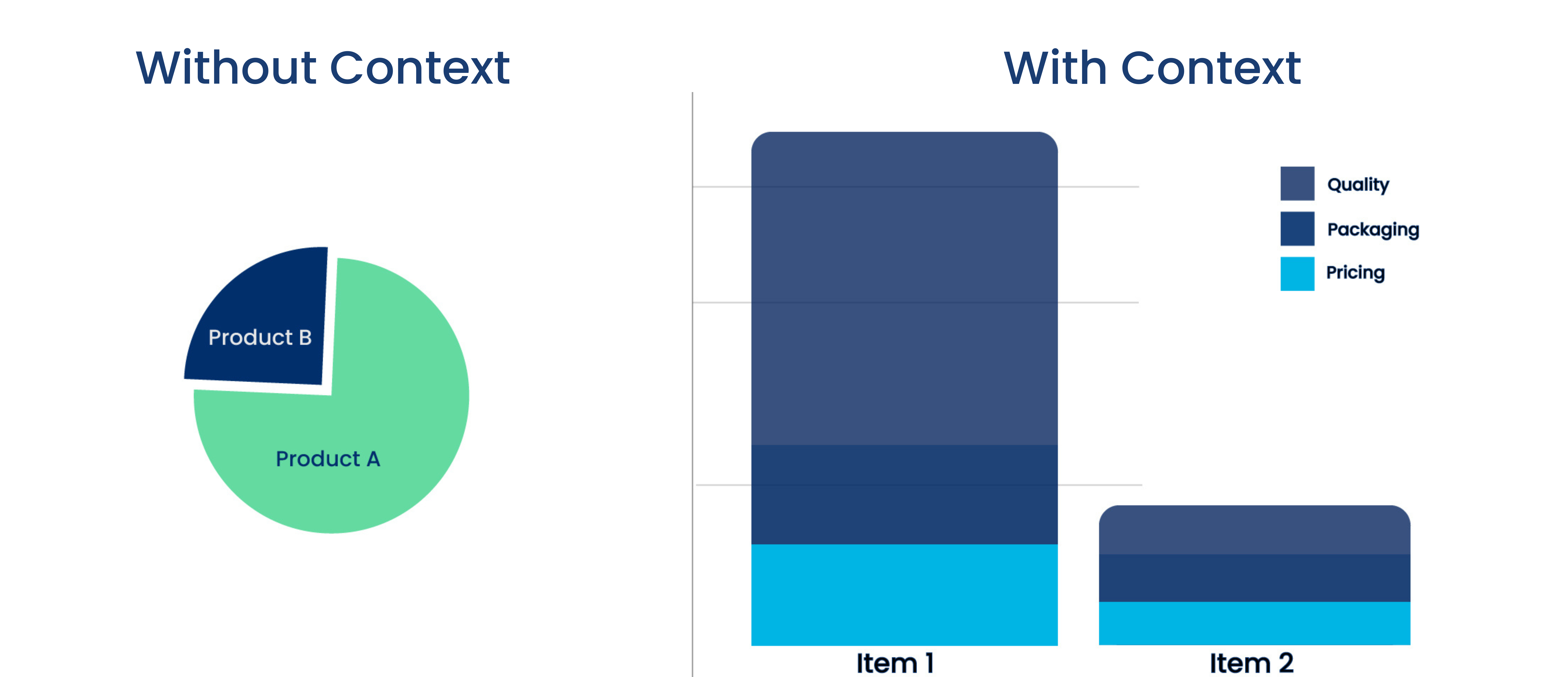
Before launching the New Coke, Coca-cola put people through a blind taste test to establish which tastes better – Coke, New Coke, or Pepsi. The respondents always chose New Coke for its superior taste. However, the New Coke was not well received, as people had associated the brand with a certain taste and the sudden shift left them perplexed. The market researchers here made the fatal flaw of dismissing brand identity while running their tests. A lack of context leads to flawed information, resulting in skewed visualization and, therefore, skewed insights.
Pillar 2: Narrating The Story

The efficacy of data visualization boils down to the potency of the data narrative. Every report or dashboard that encompasses visualized data must have a beginning, middle, and end – just like every story. Coming up with a story is quite challenging if one doesn’t have the context.
Once context comes into play, storytelling is all about how teams utilize the context in narrating the story hidden in the data. The beginning is the context of the data, the middle is the actual information, and the end is where actionability comes in. Tying all these three together visually requires skillfully trained visualizers who understand the science behind ‘where the eye goes’ (more on this later).

A Quick Detour Through GRIT Report Findings
The GreenBook Research Industry Trends (GRIT) report findings mention storytelling as one of the unmet needs among those who buy consumer insights. Among consumer insights buyers, storytelling is the third largest unmet need and must be addressed as soon as possible.

- These findings are a testament to the fact that the consumer insights market is leaning more toward the stories contained within the data can tell than the data itself.
- It is through storytelling that consumer insights buyers understand actionability aspects and its gravity.
Insight buyers are also looking for an all-in-one technology solution that lets them conduct qualitative and quantitative studies that allow for cross-study analysis and clear storytelling.
Have a Read: Making Consumer Insights More Actionable with AI and SaaS
Craft Your Insight Reports with 5W1H
The 5W1H is a problem-solving model used by multiple professions around the world. It is a technique employed to understand a situation, identify and analyze the pain point and eventually recognize solutions.
We shall break down the 5W1H and apply it to the context of data visualization, and delve deeper into the components anchoring a good-quality report.
Why – Recognize the need for collecting consumer feedback and publishing it. If the data will not serve a purpose, it’s better left unpublished.
What – Identify the type of feedback that needs to be collected for the study, depending on whether it will be qualitative or quantitative.
When – Identify the timeframes in which consumer feedback must be collected and released within the organization for maximum impact and ROI.
Where – Identify the teams amongst which consumer insights reports will be published/distributed within the organizations or outside it.
Who – I Identify the consumer segment from which to collect feedback and those that will stand to benefit from the repercussions of the report/dashboard.
How – Establish how the consumer feedback will be best utilized by identifying the best visual representation and infusing actionability into the report/dashboard.
To make things easier, we can match the 5W1H to the storytelling aspect of data visualization by mapping them to context, information, and actionability. Let’s look at three different ways this mapping can be represented.

Journey of Consumer Insights – from Context to Action
As mentioned previously, if the data visualization does not aim to serve a purpose, don’t visualize it to start with. With that, let’s delve deeper into the visualizing part of data visualization.
In the sections above, we went through the need for data visualization to have a story tied to it – a beginning, middle, and end. However, how does one make the researcher identify which part of the story is the beginning, middle, and end, in a report/dashboard? How can one urge marketers to understand context, analyze the information, and recognize the action items within data visualization?
Establish a Visual Hierarchy for Contextual Understanding
Visual hierarchy is a design principle where the designer, together with the researcher organizes the elements within a report to accurately curate a marketer through consumer feedback. It determines where the marketer’s eye must fall first, second, third, and so forth. Once the visual hierarchy is established within a report/dashboard by the designer, the marketer will read and interpret the story as the researcher intended it.
Let’s break this down.

Information Design
Different types of studies call for different visualization. It is necessary to identify which data visualization format aligns well with the narrative of the feedback. Be it a matter of visuals or numbers. There are well over 35 types of data visualization formats one can choose from. Here are a few of them:

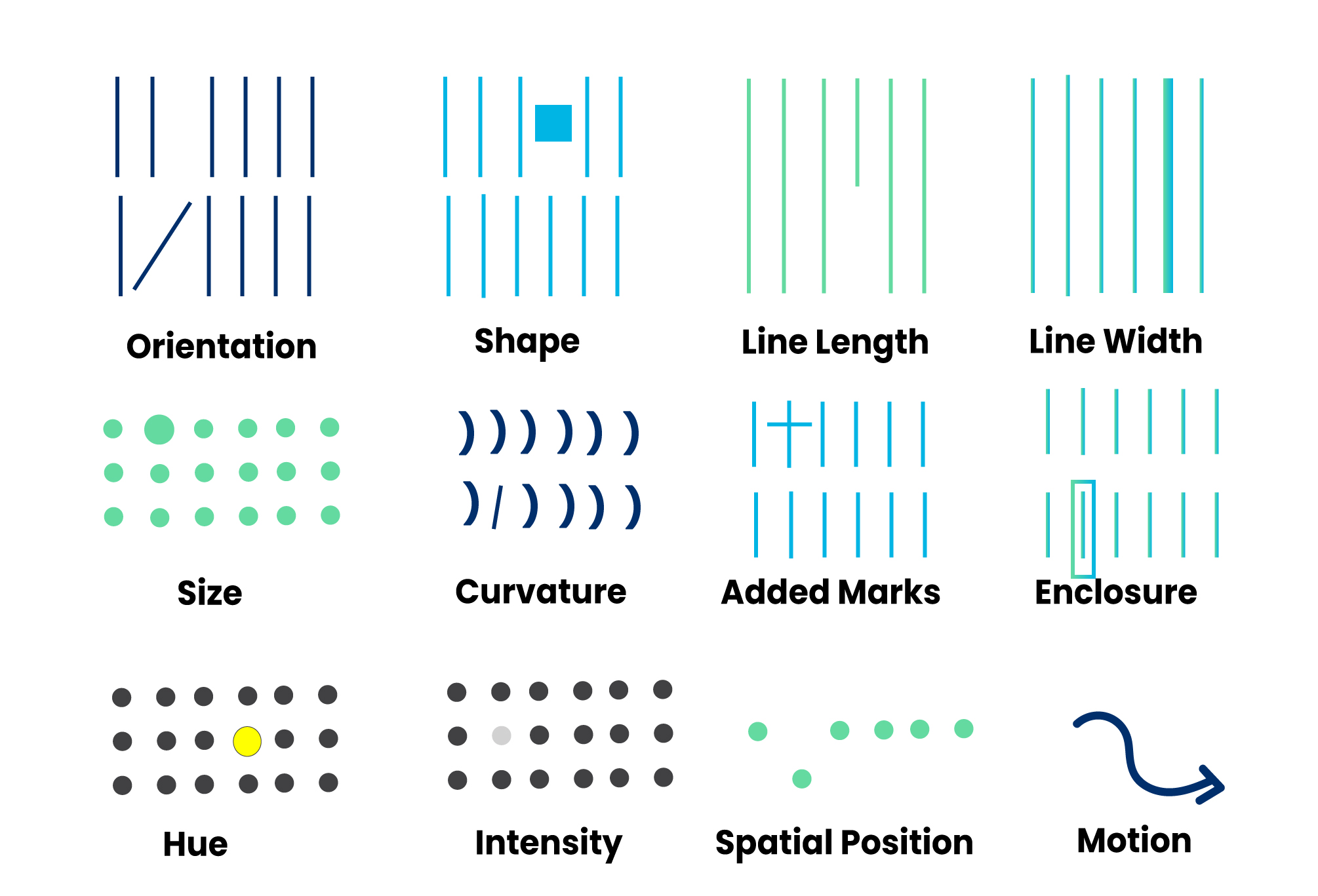
Categorical Differentiators
Categorical differentiators are how data visualizers ensure that the marketers see what they want them to see before they even realize it.
Pre-attentive attributes are visuals that the brain notices without the marketer consciously putting effort into doing so. When visualizing feedback data, designers must tap into the marketer’s iconic memory. The iconic memory is a super-short-term memory, and information stays within the brain only for a fraction of a second. Categorical differentiators are the starting point at which the marketer begins to disseminate the data.
For example, even without context, one can tell which box is bigger or how much of the pie chart is darker.

Here are the 12 types of visual pre-attentive attributes and 7 textual pre-attentive attributes

Capture And Retain Attention
As the attention economy dwindles with each passing day, data visualizers must make it a point to not only capture but retain the attention of their marketers.
With categorical differentiators, researchers can capture the attention of marketers for a fraction of a second. However, researchers and designers must work toward moving this iconic memory. The idea is to draw their eyes to certain elements by embedding a pattern between the elements.
The human eye travels in a zig-zag fashion across a page starting from the top-left corner, in the absence of visual cues. Once a pattern is recognized within the report, all that is left it to create a visual hierarchy to establish the data’s story.
Embed Actionability within Consumer Insights
The purpose of a report must be to identify rewards and risks and move towards improving and mitigating them, respectively. Actionability is the endgame of a report. If there is no scope for a call to action, the report is redundant.
It is not enough to capture attention, retain it, and instill consumer interest information into the researchers. Researchers must then represent consumer insights in a way that calls the marketer to action, to achieve the purpose of the report. The purpose could be anything from improving traffic, sales, and social engagement to identifying and mitigating waste.
Tell Stories That Matter With Integrated Research Platforms
It is impossible for researchers to run through all the consumer feedback that comes in through multiple touchpoints, analyze them, identify patterns, visualize and narrate them in reports for marketers. Which is why we bring SaaS into the picture.
Integrated research platforms bring together feedback analysis for researchers and streamlined data visualization and storytelling for marketers, making lives easier. The future of data visualization lies in intelligently automated reports and dashboards that bring together speed and accuracy of insights.
Researchers no longer have to send across survey questions and wait for consumer feedback for analysis. These integrated platforms come with survey questions that can be shared with panels and their responses are intelligently analyzed. Research needs to only add the questions and wait for a week or 2 before sharing insights with the marketers. Marketers no longer have to break their heads in trying to grasp the consumer feedback, instead, all insights are represented as appropriate calls to action.
{{cta-button}}


